Today's dress shirt is another Paul Fredrick but this one is a little special. It's a 140s broadcloth. Shirt fabric is a bit like sheets for your bed. The higher the number for thread count, the softer and more luxurious the bed clothes. This shirt is definitely the softest and most luxurious that I own.
The stripes may look fairly big but they are really tiny and grouped together to make the impression of larger stripes. The intensity of the stripes on this shirt is increased a bit by placing two (for instance) colored stripes next to each other. Likewise the intensity is lessened by placing a white stripe in between two colored stripes.
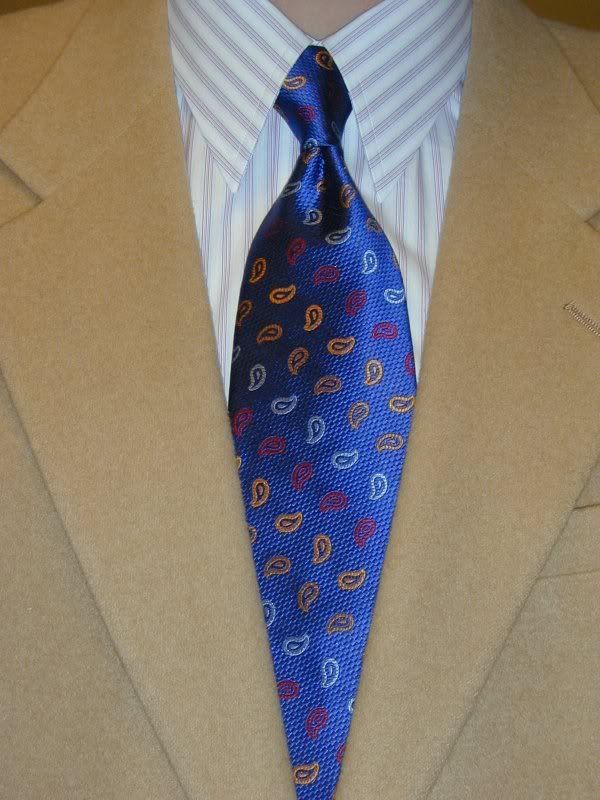
There are two colors of stripes on this shirt. Burgundy, most obviously, and blue. The blue may not be all that visible in the picture because they are each separated by white. They outline, or shadow, each set of burgundy stripes. Pretty nifty effect, really.
The necktie is also from Paul Fredrick. What gave me a bad case of the gotta-have-its with this tie is the intense, shiny blue background. The multicolored "floating" paisleys make it easy to match up in a number of different conglomerations even though I usually wear it with this shirt. I like the way the deep red paisleys pull on the burgundy stripes. The blue stripes get pulled forward a bit by the blue paisleys but also by the blue background.
I decided to go with the tan sport coat today. I was hoping it would match up with the darker gold paisleys on the necktie. I'm not really sure it quite got there. A nice attempt, I think, but I might have to try something a little different next time.
No comments:
Post a Comment